Translate the warmth of small-batch baking into a system that could remain simple in production and memorable in market.
Batch
A bold bakery brand that makes handmade feel lively, generous and contemporary.
Naming / Identity / Packaging / Illustration
Project overview
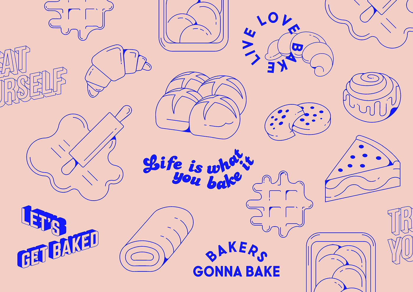
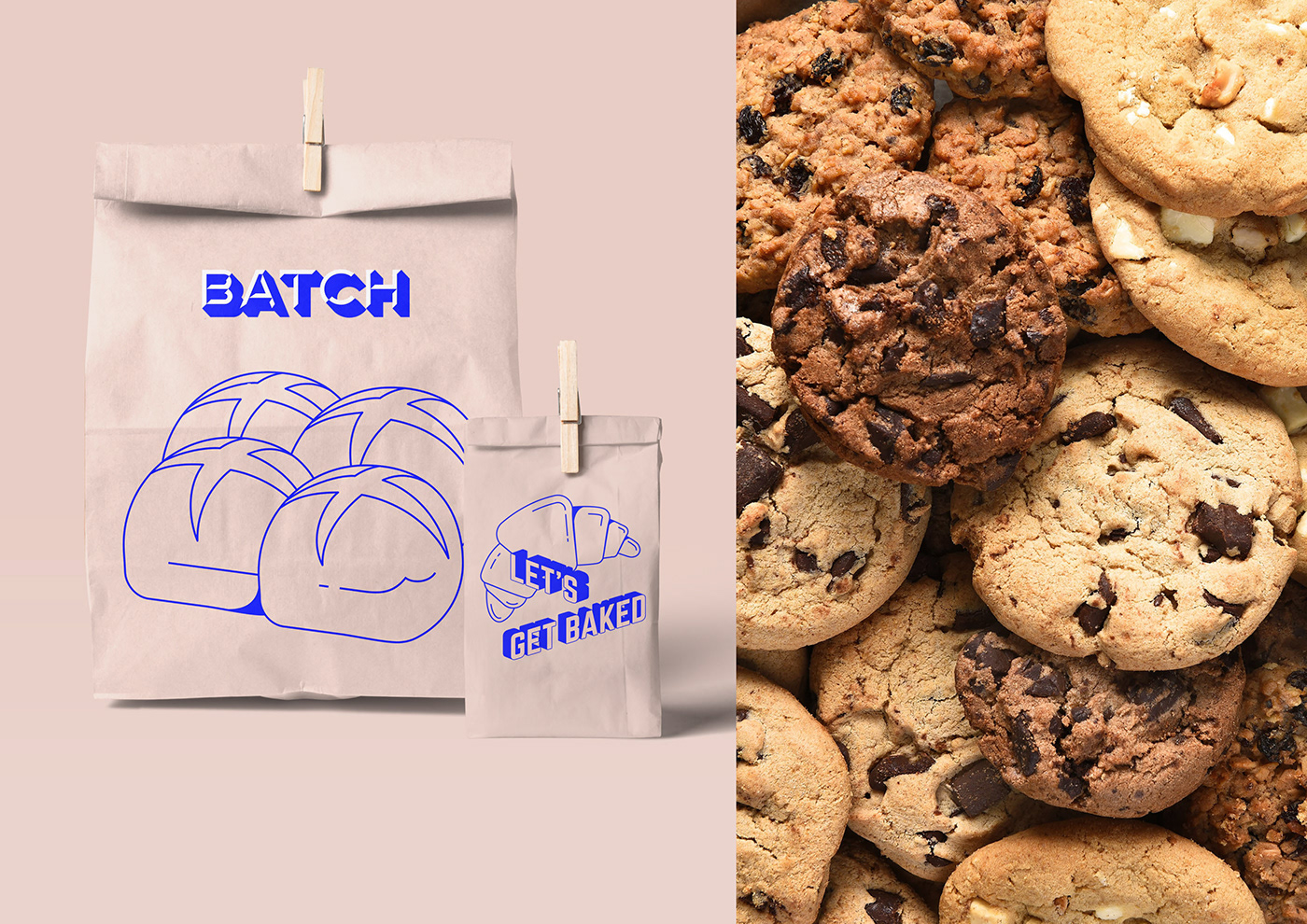
An expressive illustrated language and direct typographic system bring coherence to packaging, signage, print and everyday brand moments.
Context
Batch needed to preserve the warmth of handmade baking while feeling confident enough to grow beyond a single counter, box or neighborhood.
Idea
Treat abundance as the brand’s visual behavior. Generous illustration, oversized type and energetic composition make the experience feel fresh from the oven rather than polished into anonymity.
System
A modular identity gives every package and touchpoint a shared rhythm without forcing identical layouts. The system stays economical to produce while creating strong shelf and street recognition.
Disciplines and outputs
Food / Bakery / 2021- 01Naming direction
- 02Brand identity
- 03Packaging
- 04Illustration
- 05Signage
- 06Print system
Complete archive