Based in Florida. Working worldwide.

Project / 02Coffee / Consumer2020

Lagarto Pouco

A character-rich coffee system built to feel collected, energetic and unmistakable on shelf.

Positioning / Identity / Packaging / Print
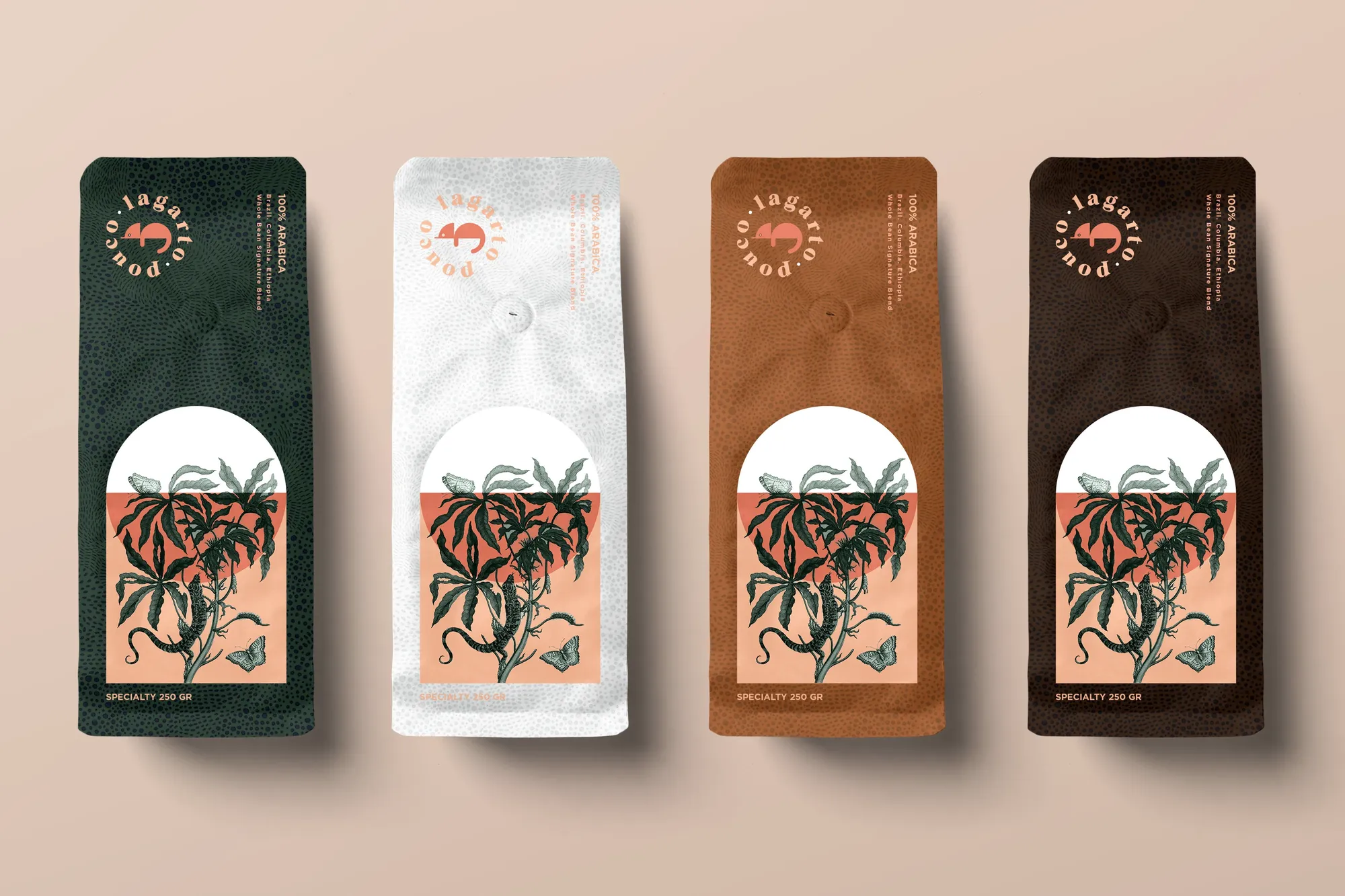
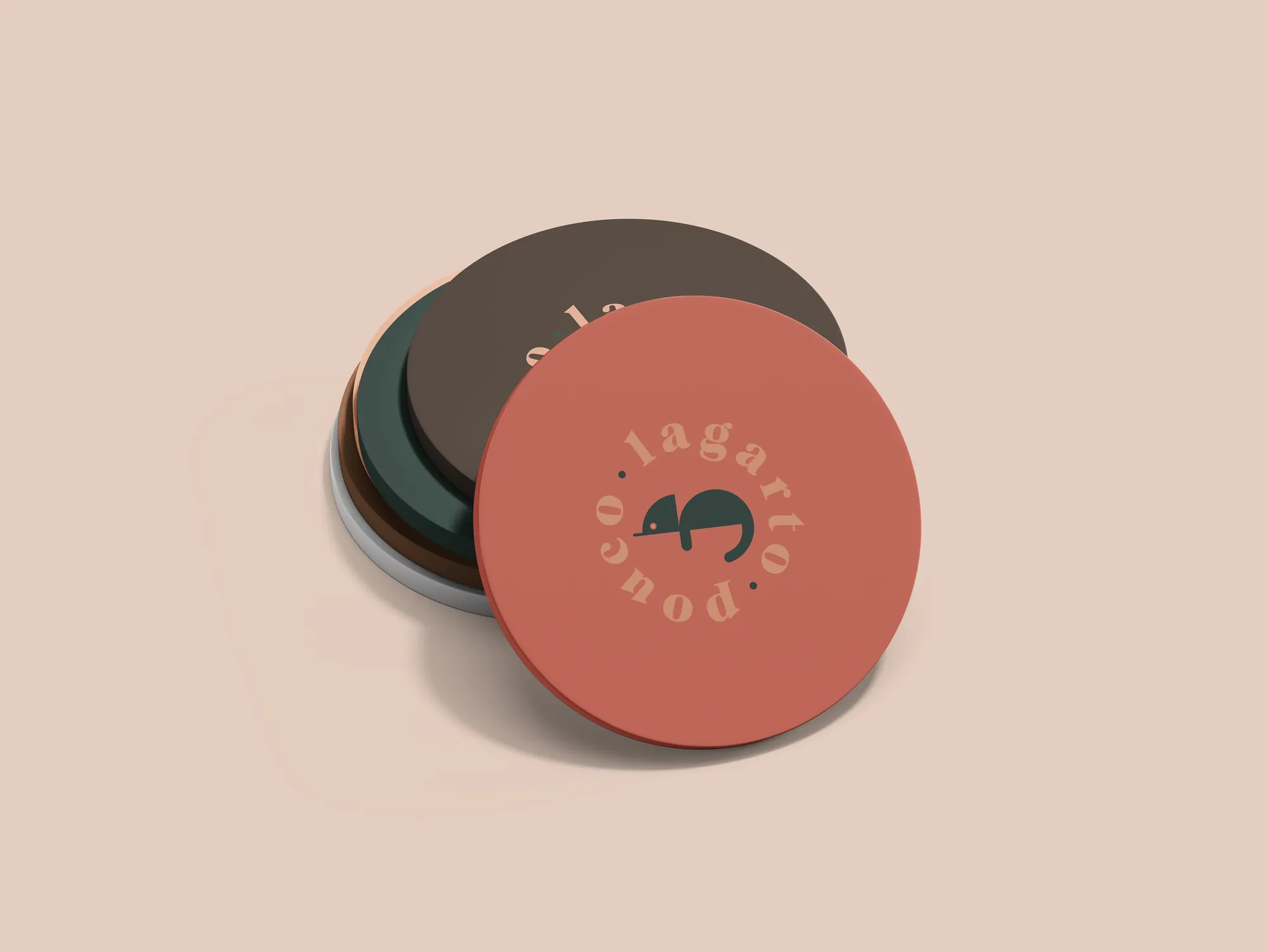
Lagarto Pouco identity system
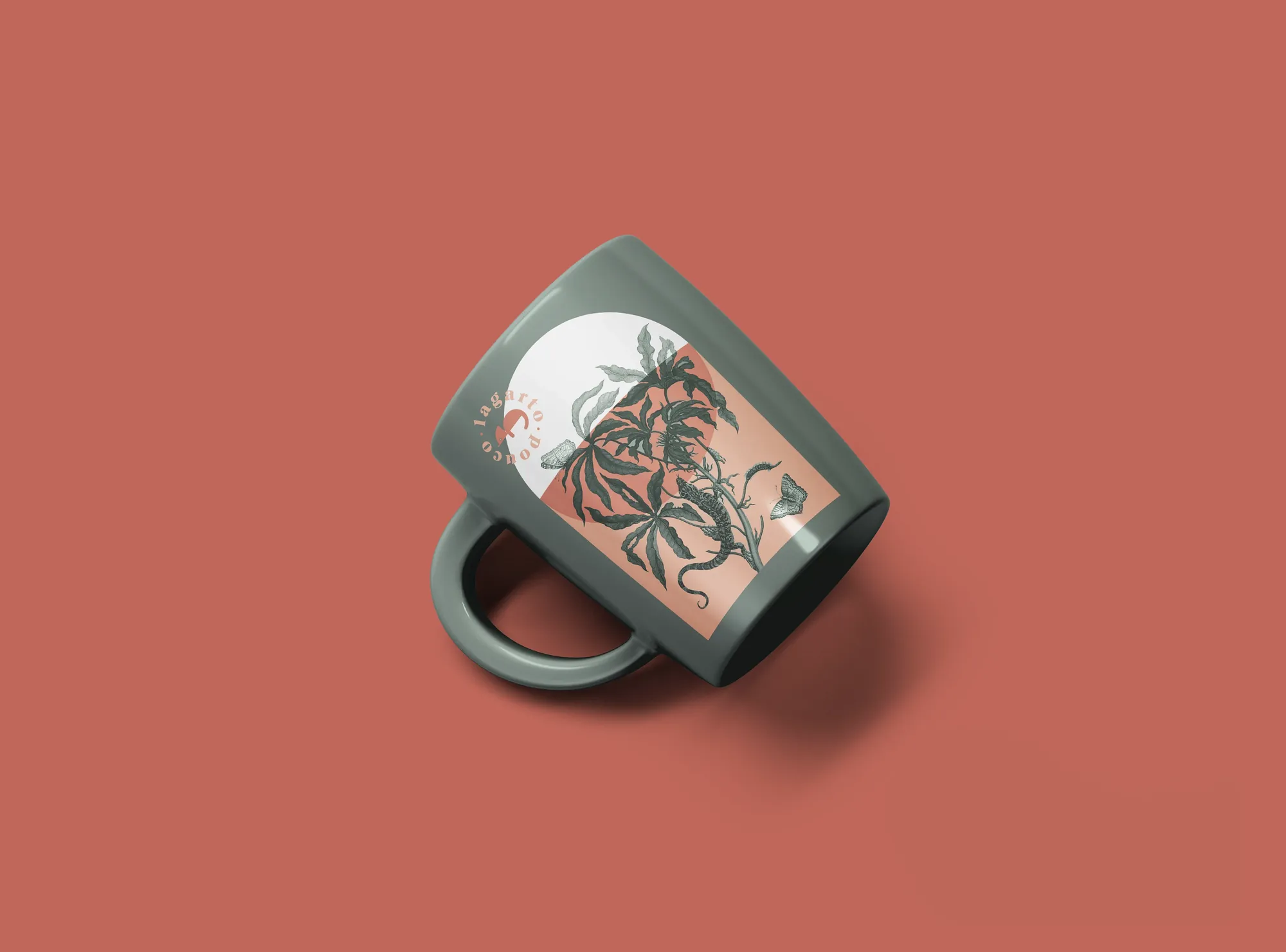
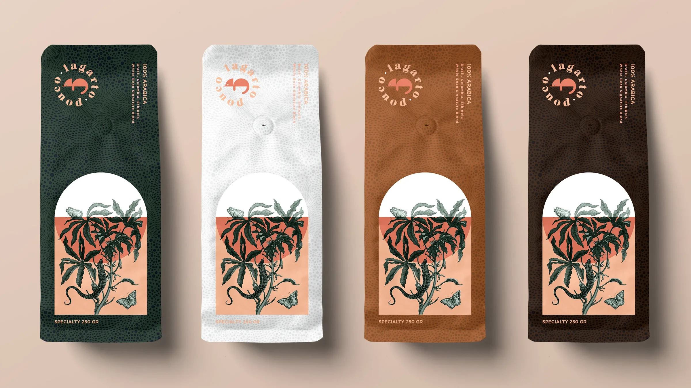
Lagarto Pouco brand system application 2
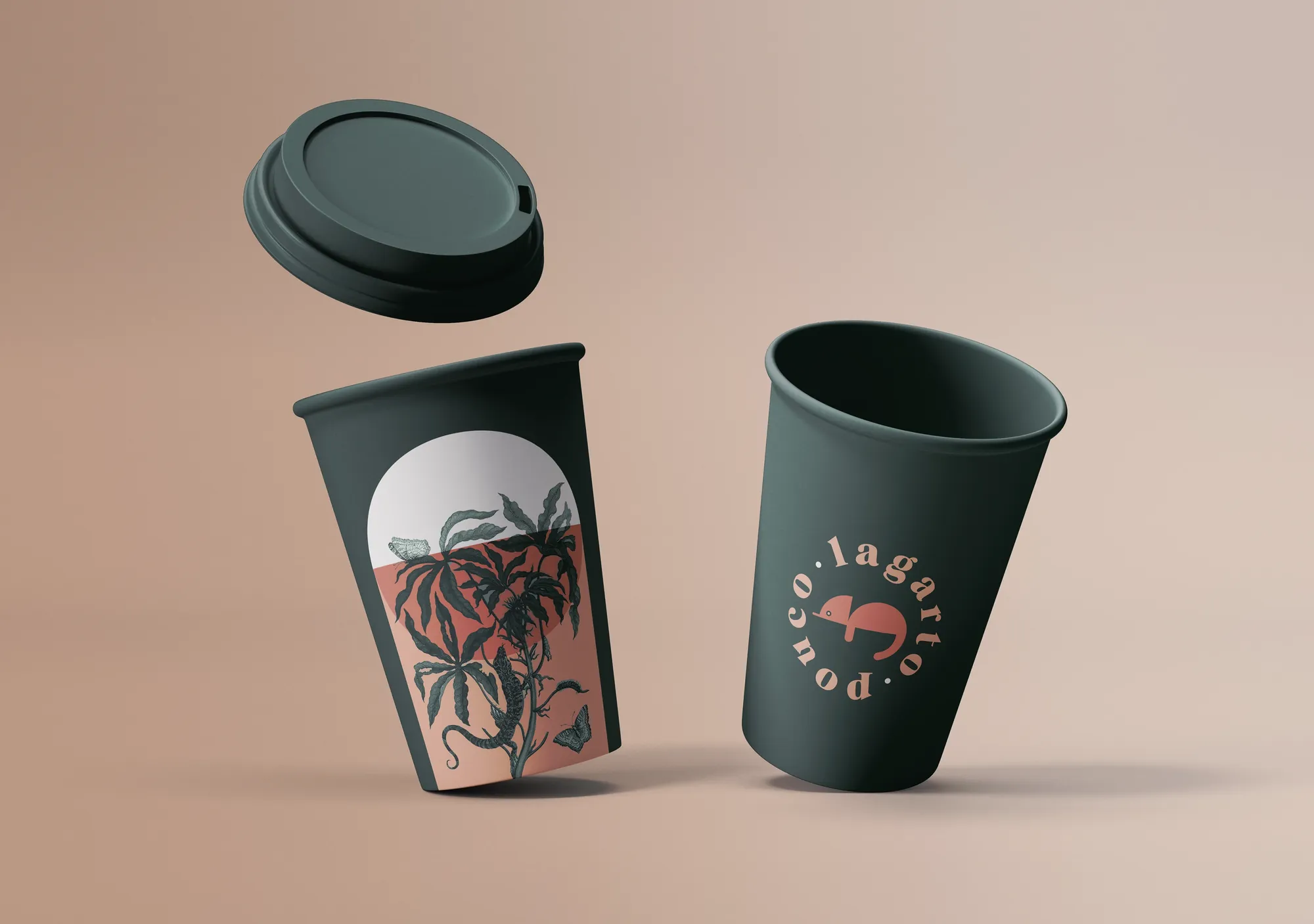
Lagarto Pouco brand system application 3

Project overview

01 / Challenge

Give an emerging coffee brand a visual idea strong enough to move across packages, collateral and future products without losing its personality.

02 / Response

An illustrated identity, confident color system and repeatable packaging architecture turn a small lizard into a large, ownable brand asset.

01

Context

Specialty coffee is crowded with tasteful minimalism. Lagarto Pouco needed an identity with more character—something people could recognize before they read the roast or origin.

02

Idea

Build the brand around a distinctive protagonist. The illustrated lizard becomes mascot, maker’s mark and storytelling device, giving the business an asset competitors cannot easily borrow.

03

System

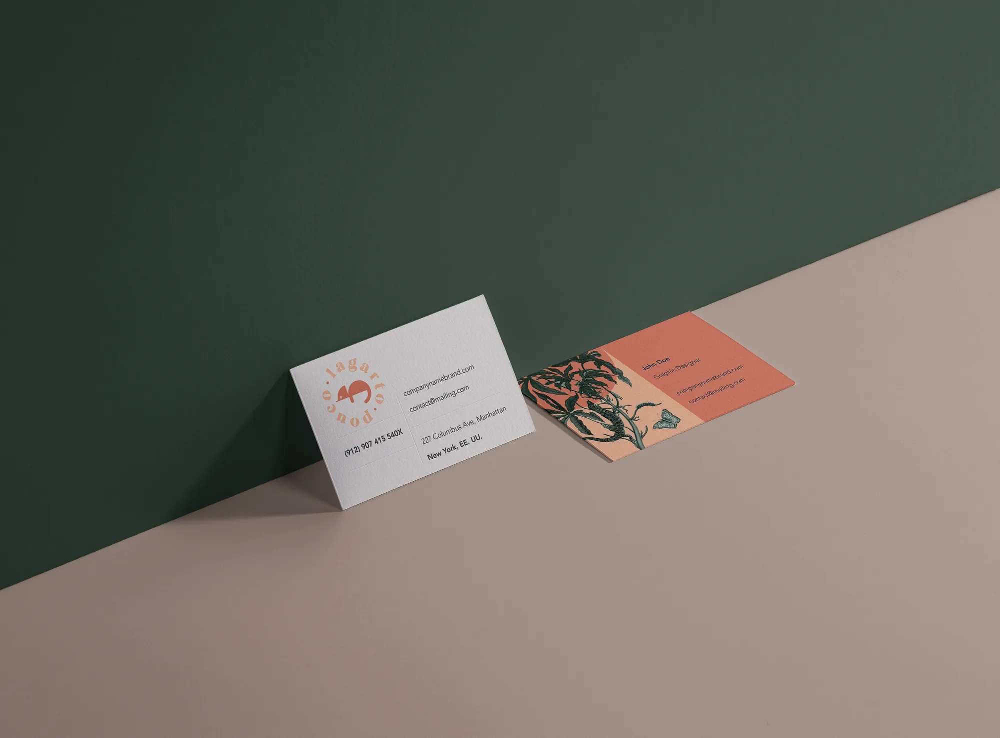
Bold color, expressive illustration and a repeatable packaging architecture create energy without sacrificing navigation. The result can expand across blends, formats, merchandise and print while remaining unmistakably Lagarto Pouco.

Disciplines and outputs

Coffee / Consumer / 2020
  1. 01Positioning
  2. 02Brand identity
  3. 03Illustration
  4. 04Coffee packaging
  5. 05Print collateral
  6. 06Merchandise direction

Complete archive

One identity.
A system of expressions.

View the complete case study on Behance ↗︎
Next projectPalm Folly