Based in Florida. Working worldwide.

Project / 03Beverage / Hospitality2021

Palm Folly

A sun-soaked beverage identity with enough eccentricity to own the cooler and the conversation.

Brand Identity / Packaging / Illustration / Guidelines
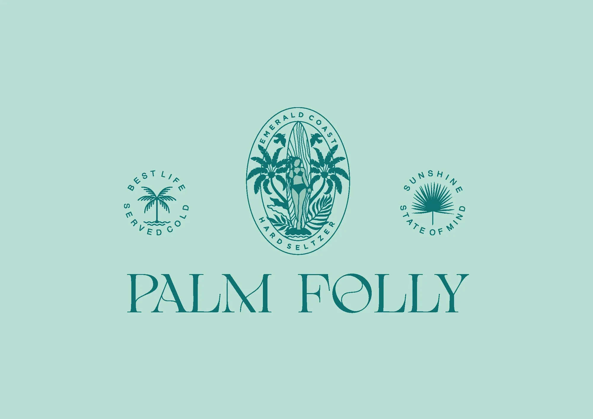
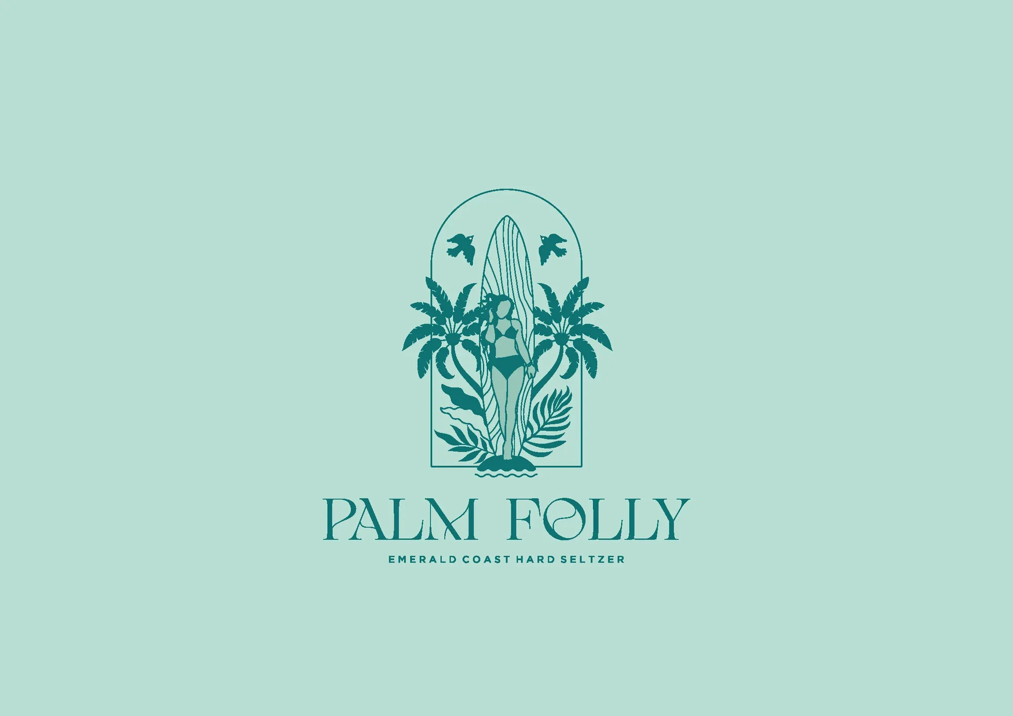
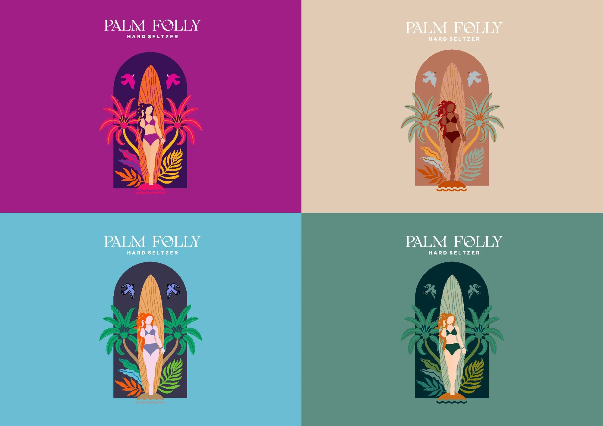
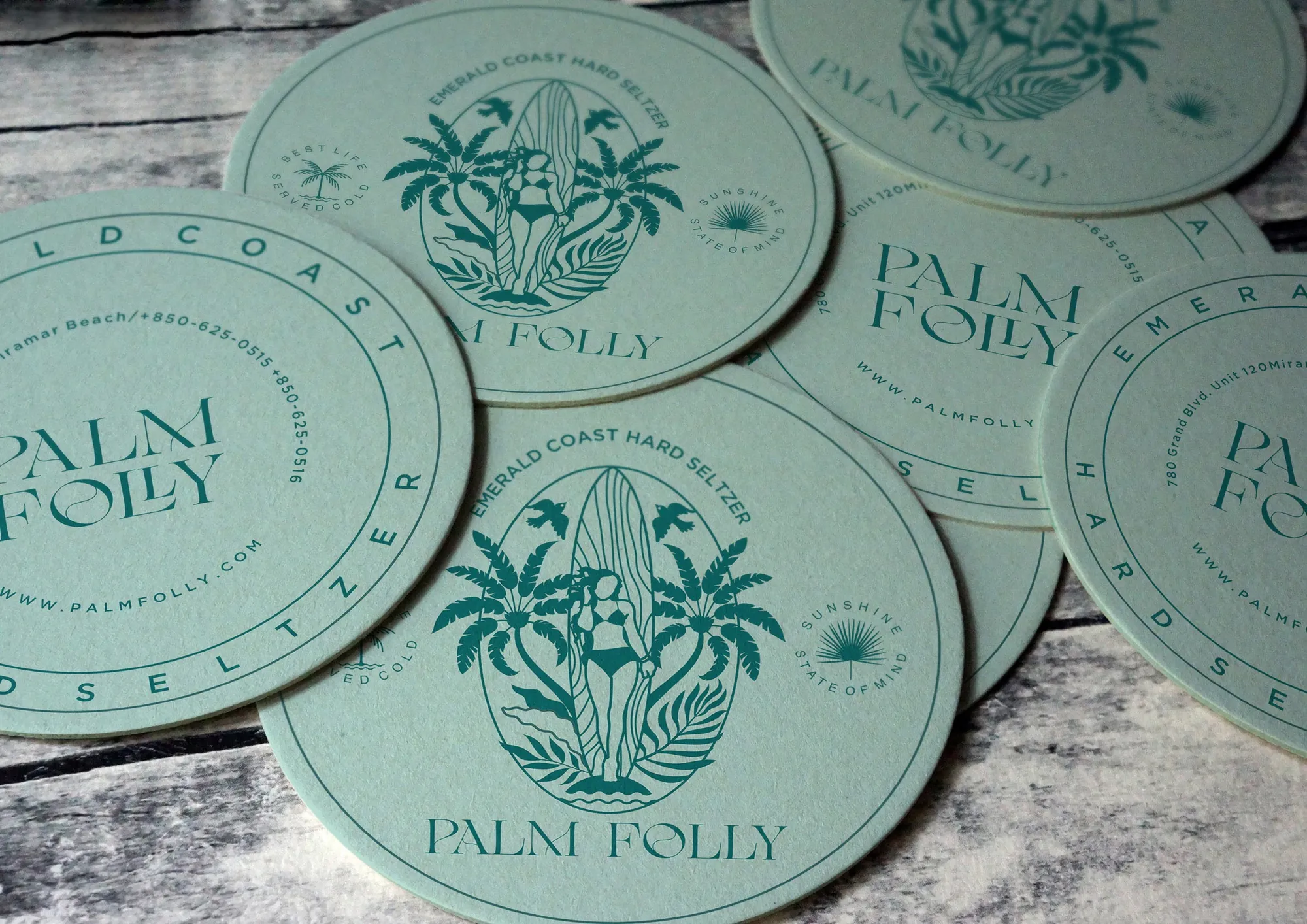
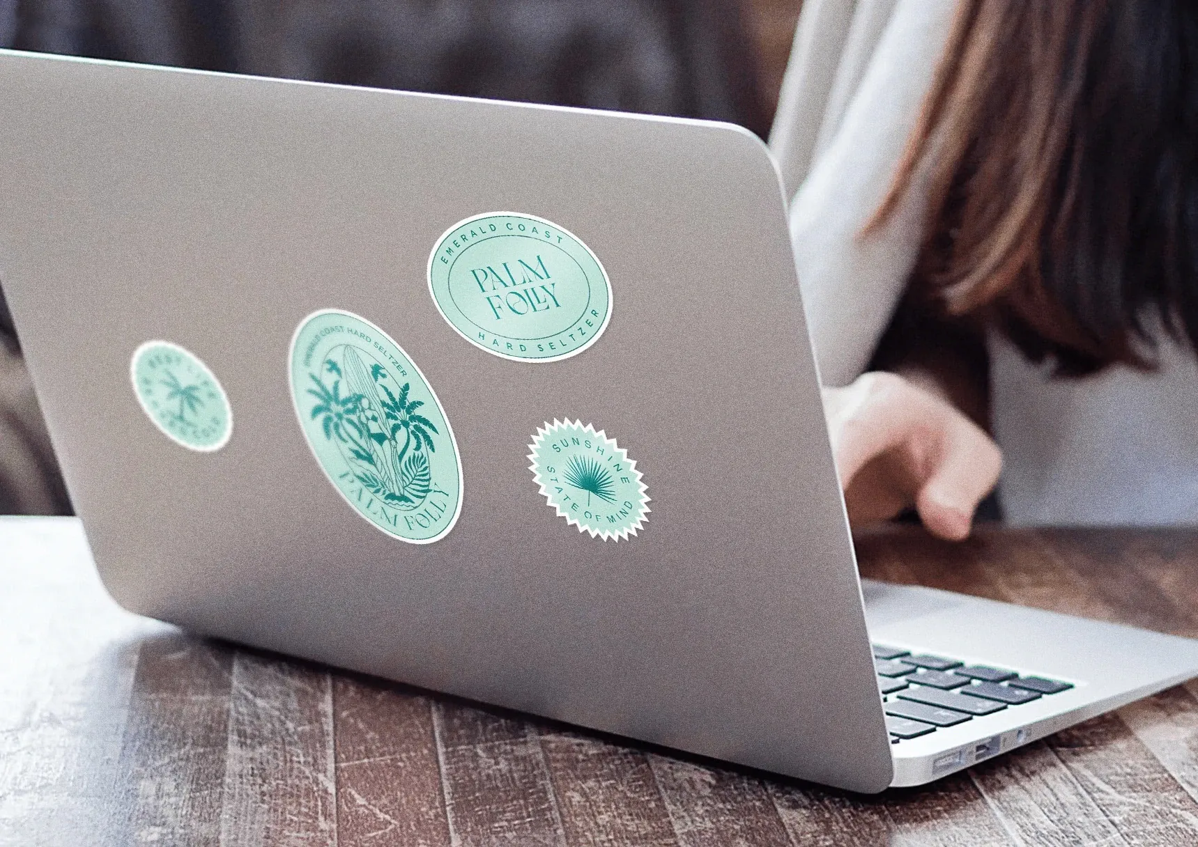
Palm Folly identity system
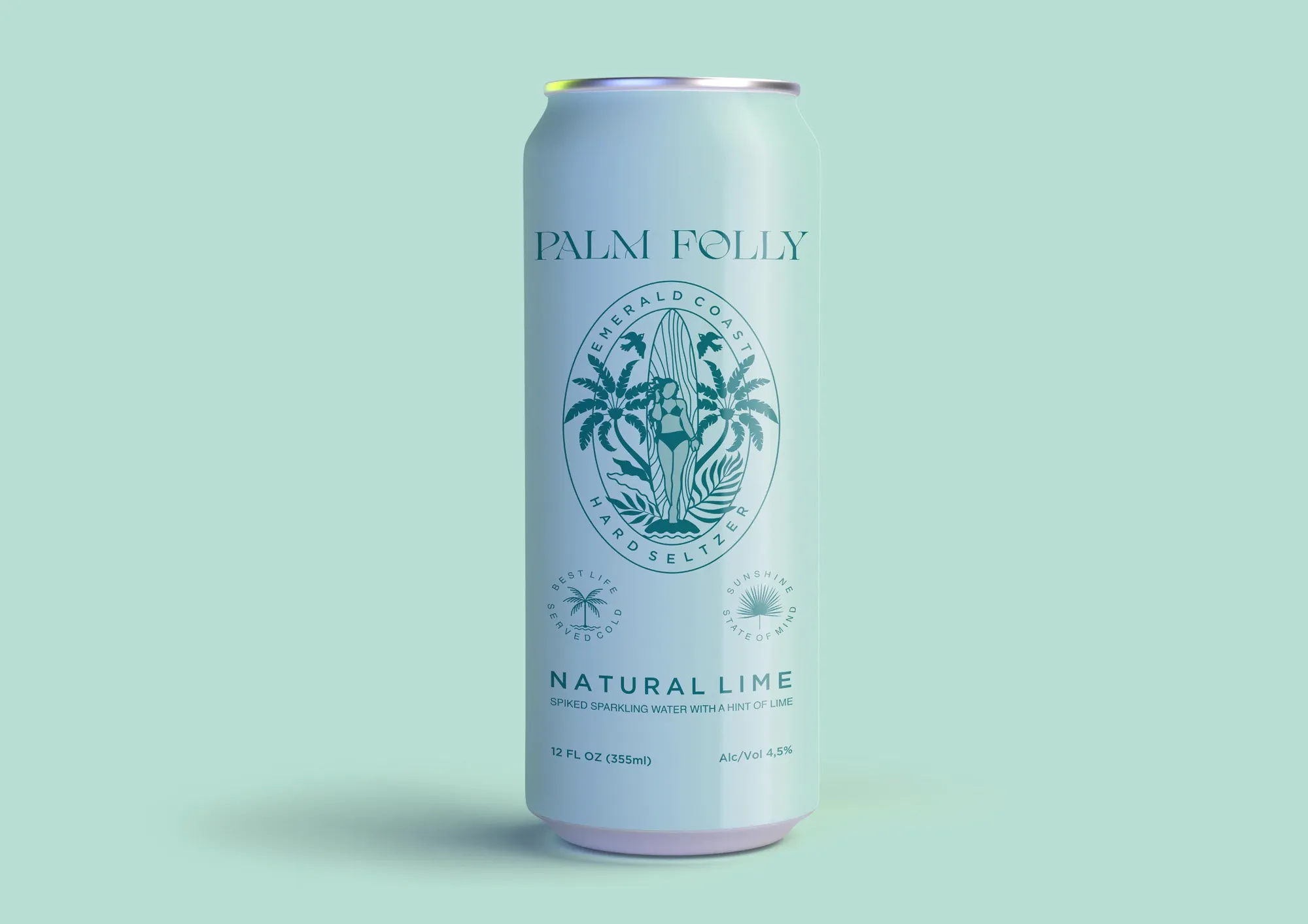
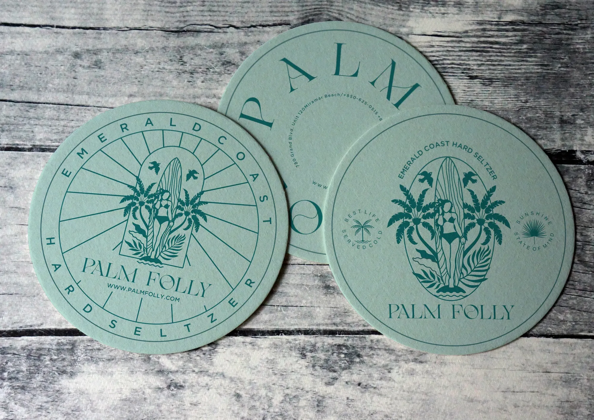
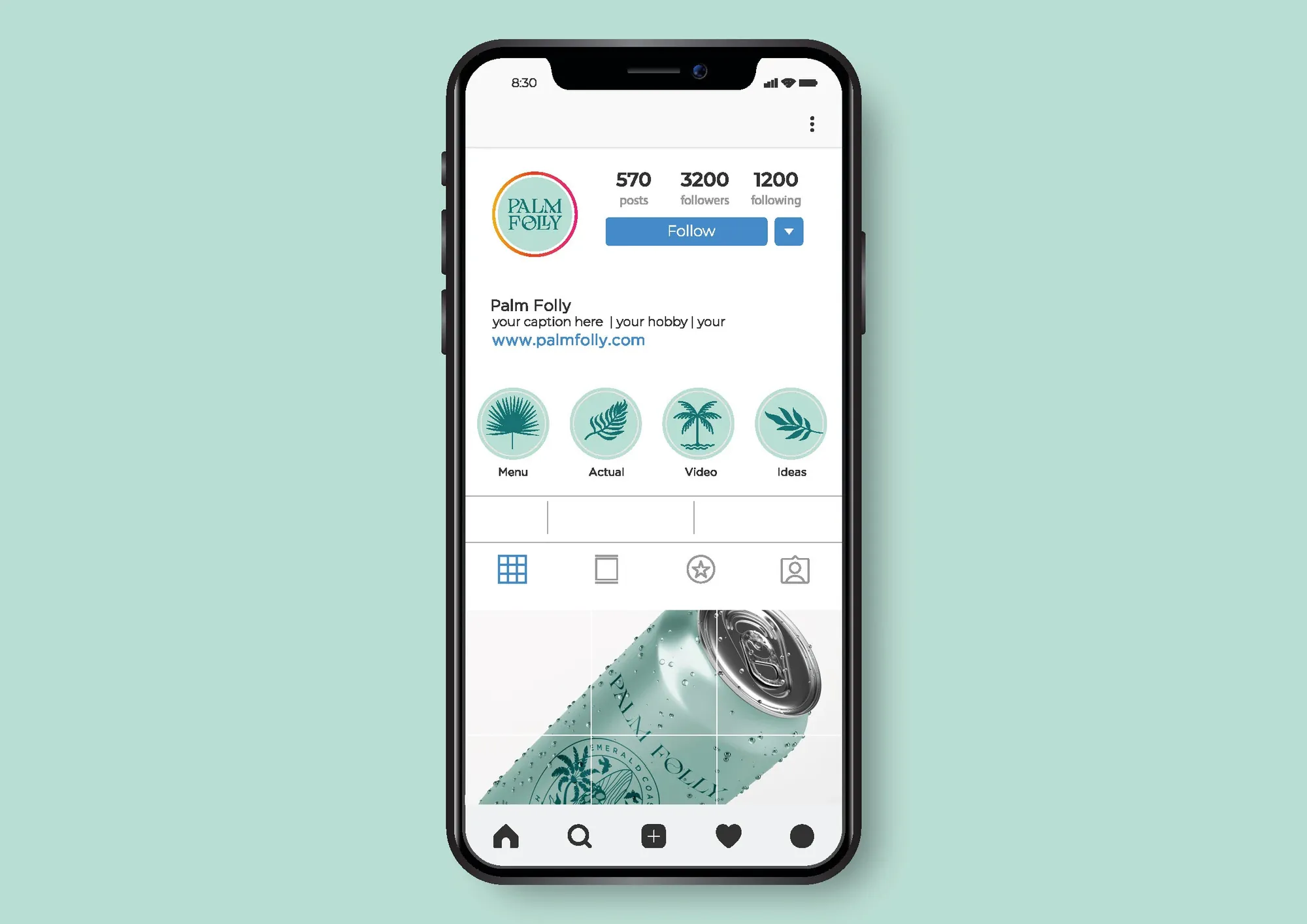
Palm Folly brand system application 2
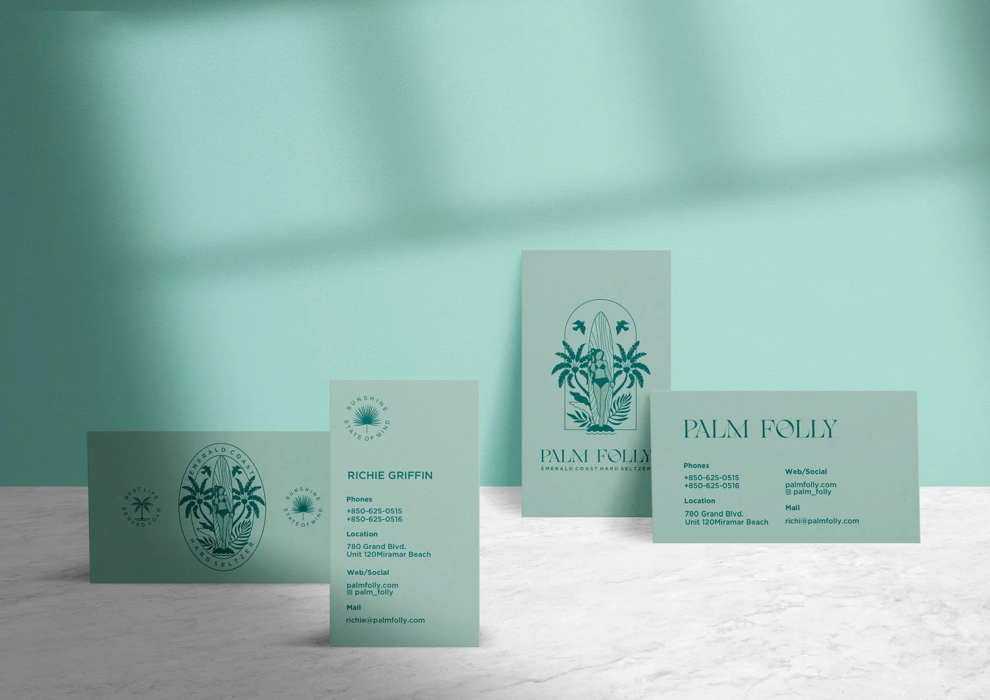
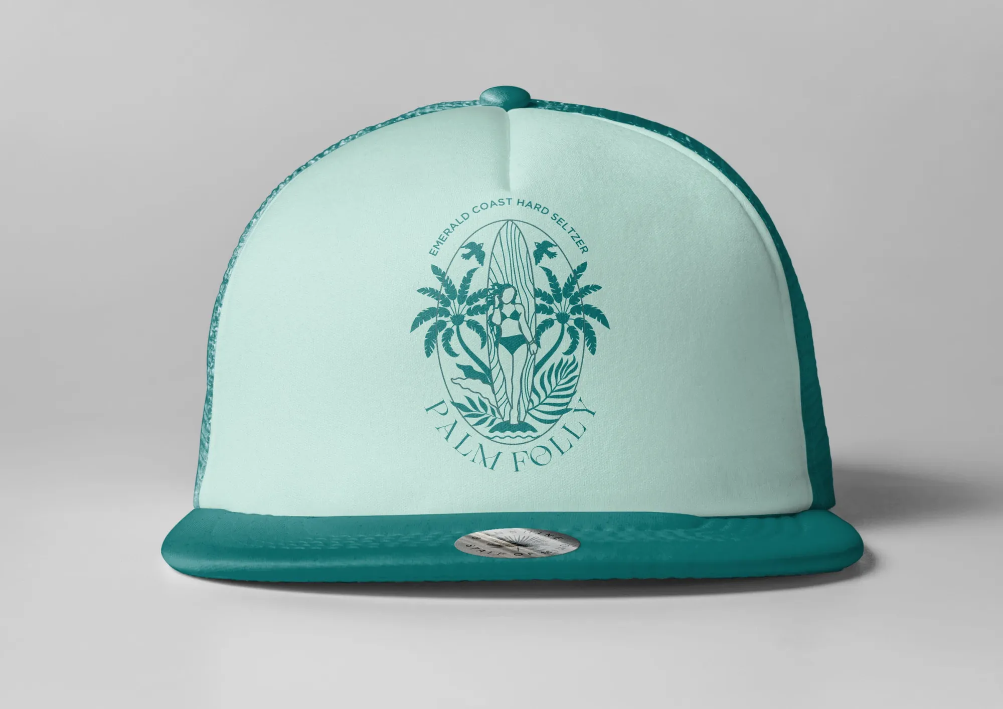
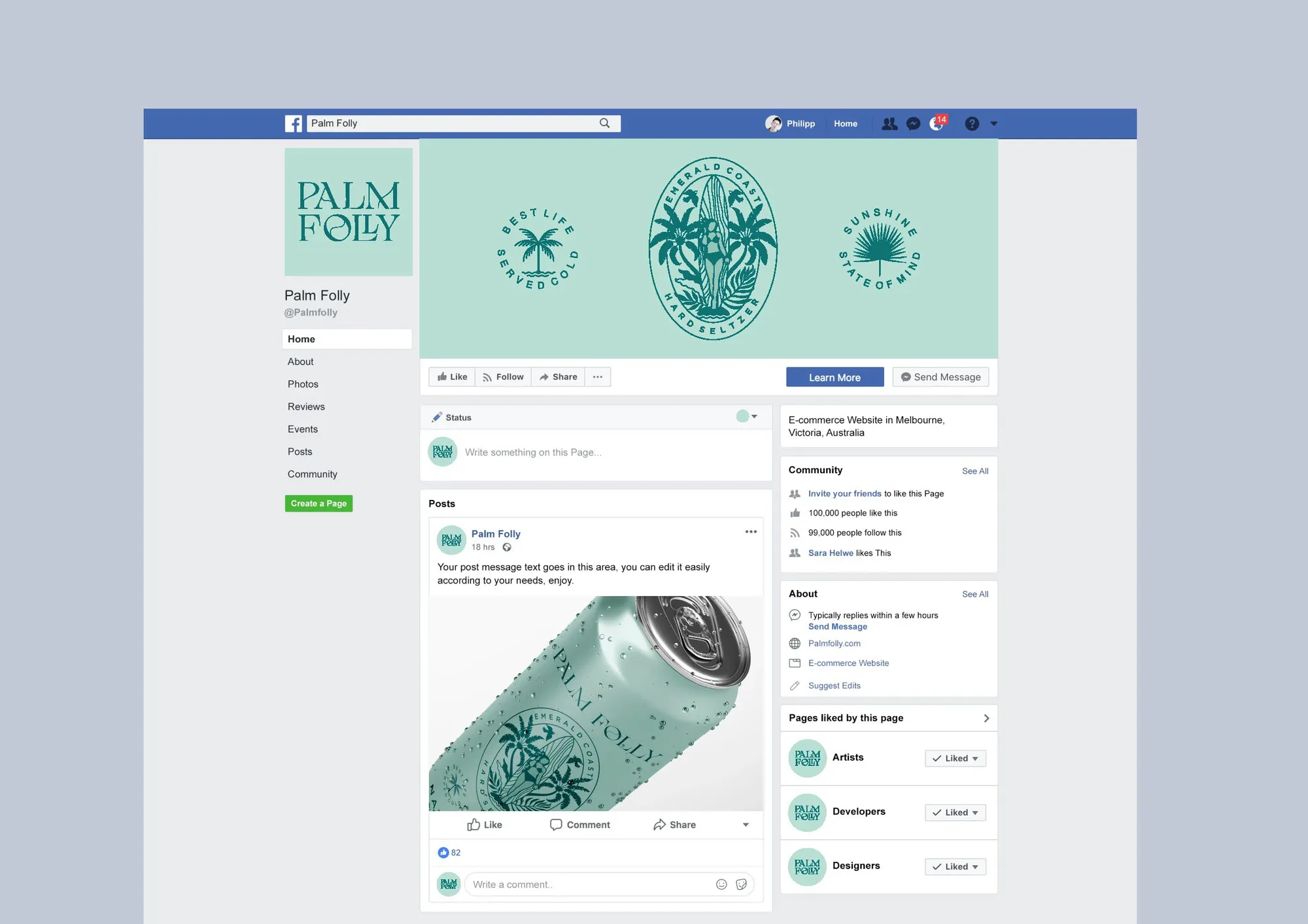
Palm Folly brand system application 3

Project overview

01 / Challenge

Build a hard-seltzer identity that could enter a saturated category without borrowing the visual language of every other beach brand.

02 / Response

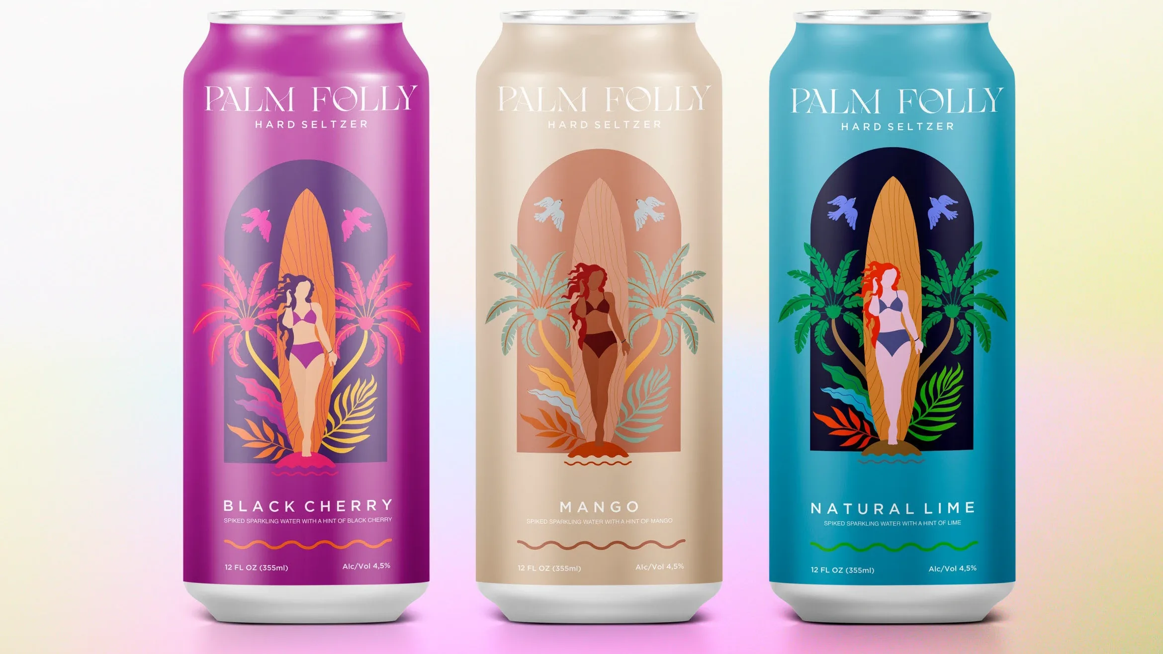
Illustration, spirited typography and a deliberately unexpected palette create a system designed for recognition across cans, cartons, merchandise and social.

01

Context

Palm Folly entered a beverage category full of interchangeable sunshine, fruit and beach cues. It needed the energy of escape without disappearing into the category’s visual wallpaper.

02

Idea

Make paradise a little strange. The brand pairs tropical familiarity with eccentric illustration and an irreverent voice, creating a world that feels sunny, social and ownable.

03

System

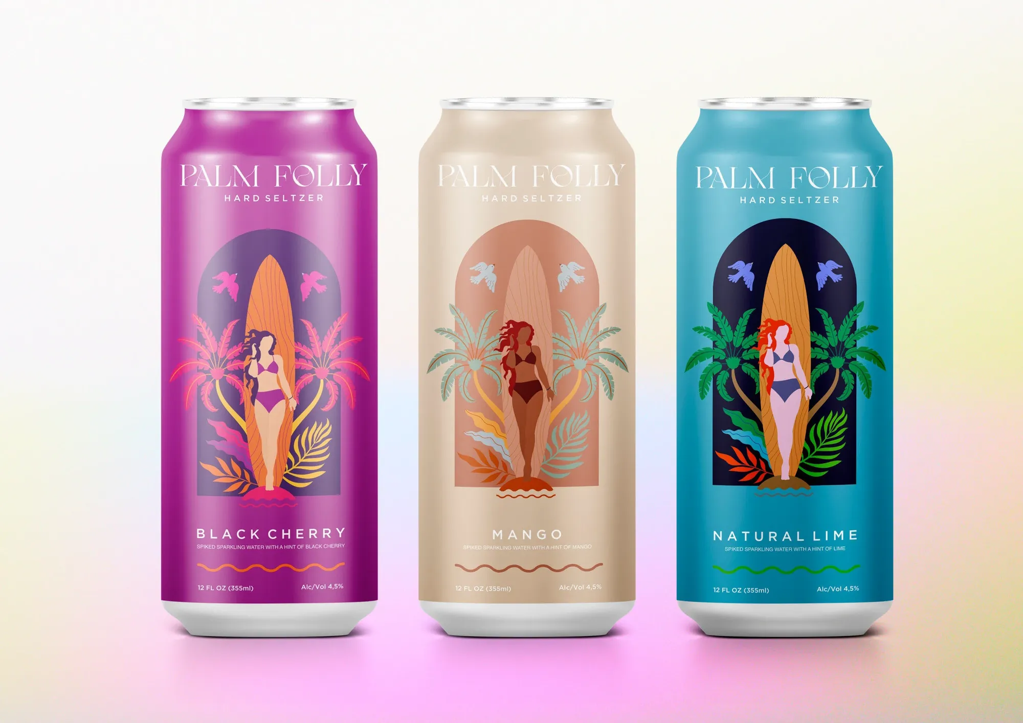
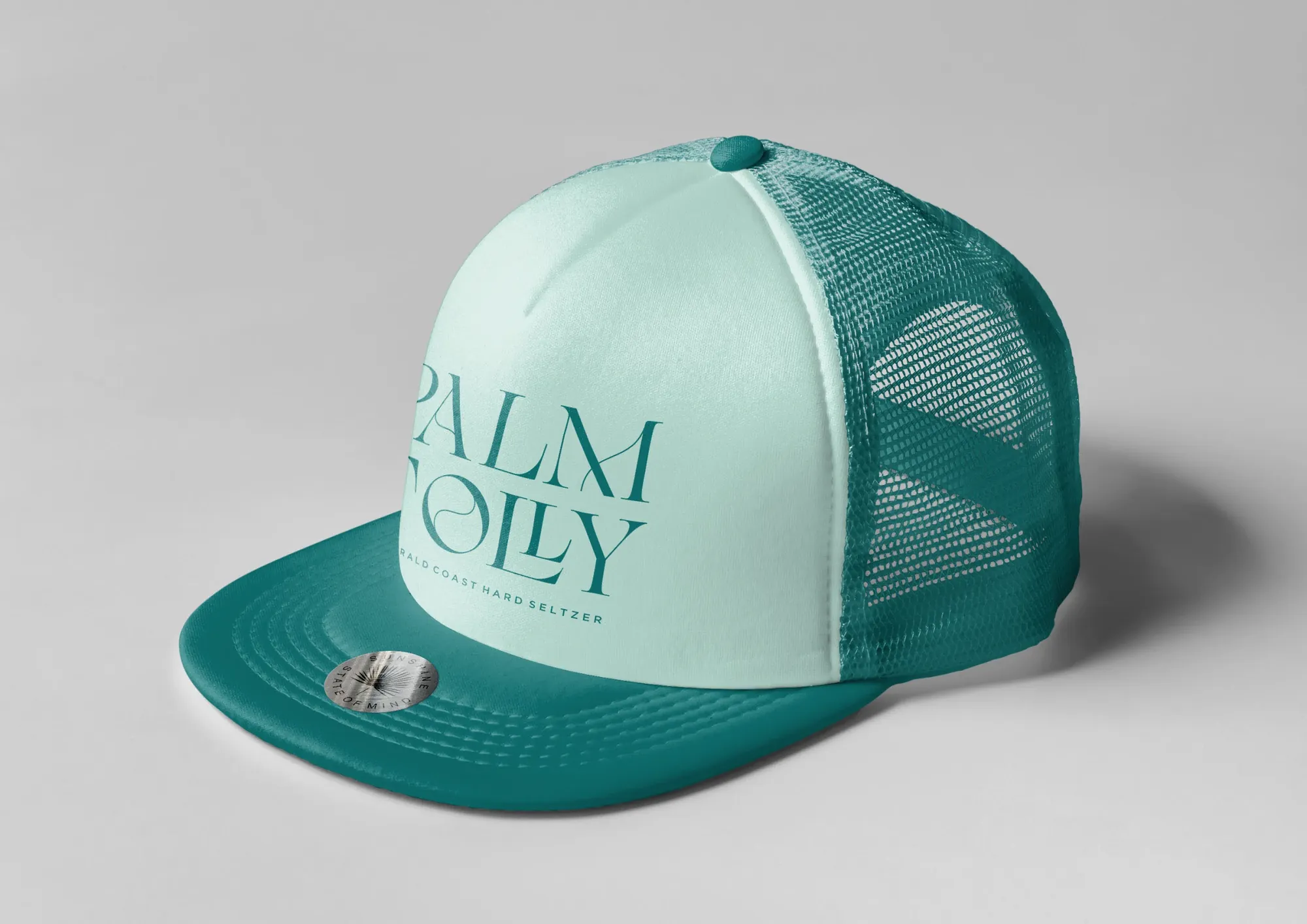
The identity is engineered for the can first, then expands into cartons, coasters, merchandise and hospitality moments. Illustration carries recognition while typography and color organize the range.

Disciplines and outputs

Beverage / Hospitality / 2021
  1. 01Brand identity
  2. 02Packaging architecture
  3. 03Illustration system
  4. 04Guidelines
  5. 05Hospitality collateral
  6. 06Merchandise

Complete archive

One identity.
A system of expressions.

View the complete case study on Behance ↗︎
Next projectBatch